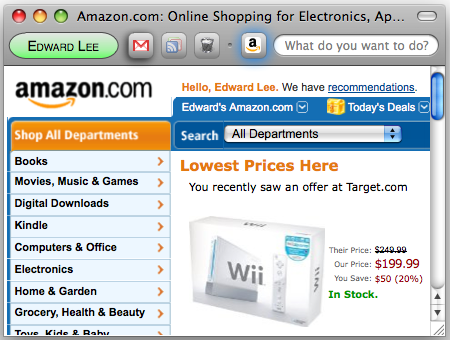
Introducing my very own web client of the future! EdBrowser!

A brand new shiny web client with buttons and boxes that's better than foxes!
Okay okay. I’m not actually making a web client of my own, but if I had a lot of time and the right infrastructure, it would probably look like the picture above. (I suppose I do have a lot of time seeing that I’m unemployed. But that does have various benefits.. no going to classes, no studying for exams, no paying income tax to blow up then rebuild bridges.. And who would want to use something called EdBrowser?!)
I’ll just go in left-to-right order describing what you can see (and don’t see) in my mock-up:
- Identity Center
- Site Launcher
- Text Input
- Web Content
Identity Center
First off, we have something new here — the web client knows who you are and lets you know who it thinks you are. (If your name isn’t shown, you’ll want to “log in” so your experience is personalized for you. Everything described further down can be stored as part of your account.)
When the client knows who you are, it makes it easy for sites to find out that it’s you if you let the site know. Now you won’t need to fiddle with logins and passwords for “simple” sites like forums. Additionally, sites can restrict sensitive data (bank accounts, emails, etc.) and require you to give the web client a password. When you do so, the client will send the server an impossible to guess “password”, which it set up earlier, and now you don’t need to worry about internet hackers guessing your bank password.
There’s a lot more functionality for this “Identity Center,” but because I made it green and ugly, I’ll talk about it at the end. 😛
Site Launcher
You might be wondering wheres the tab bar, and here it is! Kinda. You can initially think of this area as a combination of the bookmarks bar, tab bar, and history drop-down menu.
I’ve mentioned in some other post that even with a smart new-tab page, you still need to open a new tab then find the page you want to open — 2 clicks. Similar two steps if you use the drop-down menu. And bookmarks… ew.. at least the drop-down menu automatically shows the sites you frequently use instead of manually bookmarking sites.
What you really want to do is just get to a site you frequently visit. So let’s just put those sites in an easy-to-find place.. in the Site Launcher! The web client knows which sites you use frequently, and it will automatically populate the area with the icon for that site. Now when you want to open the site in a new tab, you just click on the icon. Done.
But that’s not all! When you move your pointer over the icons, it’ll show you titles and thumbnails of all your open “tabs” that share that same icon. It will also show thumbnails of pages that you frequently go to on that site. This means no more loading the site’s home page then clicking through to the actual page you want. It shows up right there – accessible with a single click.
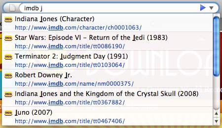
And as a bonus, you would be able to search the listing of tabs and pages you frequently visit to restrict your searches to just that one site.

Opened sites, unopened sites, trash and active tabs
The Site Launcher has 3 main components:
- Sites you commonly use
- Trash for removed sites
- New/temporary sites
When you visit a site not in the Site Launcher, it shows up towards the right side — to the right of the dot. If you want to “pin” the site, just drag it to the left of the dot. You can close that site just by dragging it to the trash or any other normal way you would close a “tab.”
While the trash isn’t really a site, you can still hover over it just like any other site’s icon. Except now it shows you thumbnails of sites you’ve recently closed and might want to reopen. “Undo” is such a great feature! 🙂
The dot is there for you to drag if you want more space for sites to automatically fill in to the left side. But hey, you’ve got a lot of space now that there’s just the Identity Center, Site Launcher, and some small Text Input box…
Text Input
Not much to explain here. Just type what you want to do. You can execute commands or search your history and/or the web. You could just put text to store there if you wanted. I suppose you could type a URL, but why do that when you’ve got the Site Launcher!
But about the location bar.. There’s nothing showing URLs anywhere. Not in this text box or when showing sites you might want to launch — those are just titles and thumbnails. (Wait! Didn’t this guy make the AwesomeBar awesome?! Oh well.. 😛 Okay fine. You can still get to the current URL and edit it, but it’s not shown in the main interface.)
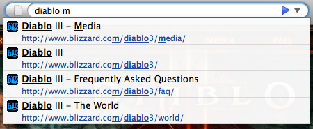
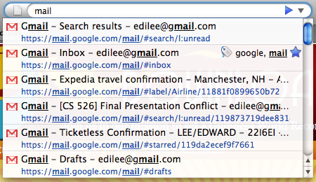
I lied. It’s not really just a text box for input. When you click on the “text box,” it also opens up bigger box in the middle of the screen, so when you type it shows up in both places. This box will show the results of what you’ve typed in. So it could be a map of an address you’ve selected or pages that you might want to go to. And after you hit enter for the command or search, the input box clears itself.
Web Content
Content is king! Lots of space for it here with just little partitioned off to the web client.
So I’ve already talked about web sites knowing who you are, and now you won’t need to keep logging into sites before you use them. But there’s more websites can do with information if you give them access!

Share your history to find great deals (but no Wii will be that cheap...)
If I’ve given Amazon.com access to my Target.com history, the next time I visit, the site can figure out what items I’ve been looking at and hopefully offer me a better deal. No need for me to manually search for the same item across multiple websites.
Another example would be sharing my digg.com history with a news aggregator site like Google News. It can know that I dugg an article and show me news stories related. Additionally Google could dig deeper and find when the original article was submitted or when I dugg it and only show news that has happened or updated since those times.
Identity Center
Back to the ugly green button. It actually comes in different colors like red and gray. It would also have a different emphasis state when the site wants to get at more of your data (but hopefully it’s not an annoying animation..)
For example, when you first visit a site, the button will appear gray because you haven’t given the site any access. It would then try to get your attention, and pointing your cursor at it would show a message like “Site ABC would like to know who you are. 40% of your friends have granted access; 3% deny. Grant or Deny?” Granting access could be limited to just the site knowing that if you “log in” to your web client from somewhere else, it’ll know it’s you again. This can be done without ever giving away your name or other personal information.
Having the web client know about your social network is nice, but re-entering all your information to a web client is a pain. You already have a lot of information on a number of websites, so let’s collect that. When you visit certain sites, the Identity Center could let you know that you can extract data from those sites and securely store it on your profile. Then you can share that information with other sites you visit if you choose to do so.

Crude mock-up of attempting to grab attention
Other situations where the Identity Center button might want your attention is if the site wants to know more than just who you are. Clicking the button could show a list of sites that you might have history for. If you do have history, you can preview what information is sent to the site as well as visit the sites that you haven’t been to before.
If Amazon.com is asking for your visit history of competitor’s websites, they’re also giving away which competitors they’re interested in. You could then navigate to new sites that you didn’t even know about. (Or just visit the ones where your friends have also visited and granted access.)
There’s an endless combination of what can be done with having your data accessible online while selectively giving out certain portions to certain sites. Also, there’s plenty of interesting personal data that already exists on some sites, so you could unleash so much potential if it was easy to make that information available.

Do you have suggestions to streamline user tasks in this new web client?
So that’s a quick overview of some parts of my imaginary EdBrowser. There’s plenty more that I’ve thought about but am currently too tired to write up. But even if this web client doesn’t exist yet, the technologies needed to make something like this are coming in. There’s the AwesomeBar as part of Places that pushed towards adaptive behaviors and Ubiquity for new interfaces for “doing stuff.” And there’s Weave for securely pushing data to the cloud and letting the user selectively open it up.
The user is the focus of attention here, and making the experience better and more streamlined is the goal. The user isn’t just passively browsing the web anymore as s/he gets to leverage the web client to easily get at whatever is desired. (So actually.. User is King! or Queen! 😉 )
